Techniques for Implementing Dark Mode in Web Design

7 Techniques for Implementing Dark Mode in Web Design

Table of Contents

Key Takeaways


Detect user settings to enable dark mode based on their preferences.


Create a color scheme that enhances readability and aesthetics in dark mode.


Adjust font colors and spacing to ensure text is easily readable in dark mode.


Modify interface elements to maintain clarity and usability in dark mode.


Use CSS variables to simplify the process of switching between light and dark modes.


Apply transition effects for a seamless and visually appealing switch between modes.


Conduct extensive testing to ensure dark mode works well across all devices and environments.


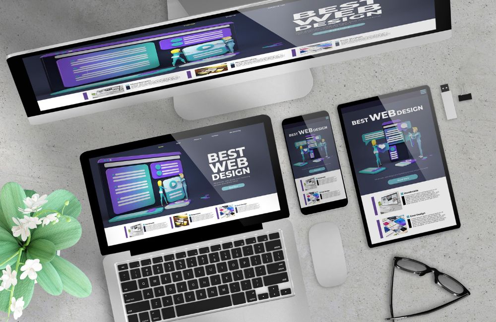
As web design continues to evolve, dark mode has become an increasingly popular feature among users. In fact, 64.6% of users prefer websites to switch to dark mode automatically, highlighting the importance of this option. Implementing dark mode not only enhances user experience but also offers aesthetic and functional benefits. To implement this functionality, we’ll walk you through different strategies that you can try out with a web design company in Charlotte, NC. 

Implementing Dark Mode in Web Design

7 Strategies for Implementing Dark Mode in Web Design

Different approaches and techniques can be employed to ensure a seamless and effective integration. Consider these seven strategies for successfully implementing dark mode on your website:

1. Identify User Preferences

Implementing dark mode in web design starts with understanding your user’s preferences. This ensures a smoother user experience and makes your website more responsive to individual needs. Here’s how to identify if a user prefers dark mode:


Detect User Settings for Dark Mode

Modern operating systems and browsers allow users to set a preference for dark mode. As a web designer, tapping into these settings can help you automatically apply dark mode to your website. Here’s how to detect these settings:

  • System Preferences: Many operating systems, such as Windows, macOS, iOS, and Android, allow users to set a system-wide preference for dark mode. This preference can be accessed by web browsers and used to apply the appropriate theme on websites.


  • Browser Settings: Browsers like Chrome, Firefox, and Safari can also be set to use dark mode based on user preferences or the time of day. These settings are often linked to the system settings but can be independently configured as well.


Use JavaScript or CSS Media Queries

To determine if dark mode is preferred by the user, you can use JavaScript or CSS media queries. This helps in dynamically adjusting the web design according to user preferences.

  • CSS Media Queries: CSS provides a straightforward way to detect if a user has a preference for dark mode through the prefers-color-scheme media feature. This ensures that your web design automatically switches to dark mode if the user’s system is set to dark mode.


  • JavaScript Detection: JavaScript can also be used to detect dark mode preferences and dynamically apply styles. By using JavaScript, you can add more complex logic and interactivity to your web design, such as toggling between themes with a button click.


Benefits of Detecting User Preferences

Understanding and applying user preferences for dark mode in web design has several benefits:

  • Enhanced User Experience: Automatically aligning with the user’s system settings makes for a seamless experience. Users are less likely to manually switch modes if the website already matches their preference.


  • Accessibility: Matching system preferences ensures better accessibility for users who rely on dark mode to reduce eye strain. It shows that your web design is considerate of users with specific needs.


  • Consistency: Consistency across different applications and websites improves overall user satisfaction. Users appreciate when their preferences are respected and applied universally.

2. Design a Dark Color Palette

Creating a visually appealing and functional dark color palette is essential for implementing dark mode in web design. A well-designed dark palette enhances user experience and ensures accessibility. Here’s how to create a set of colors specifically for dark mode and ensure they meet accessibility standards.


Selecting Base Colors

Choosing the right base colors is crucial for creating an effective dark mode. Here are the steps to consider:


  • Choose a Primary Dark Color: This color will be the foundation of your dark mode design. Opt for deep shades like black, dark gray, or navy blue.

  • Pick Secondary Colors: Select shades that complement the primary dark color. Use these for backgrounds, cards, and secondary elements.


Adding Accent Colors

Accent colors play a vital role in highlighting key elements in dark mode. Follow these guidelines to select the best accent colors:


  • Highlight Key Elements: Choose colors that stand out against the dark background for buttons, links, and highlights. Ensure these colors are vibrant but not too bright.

  • Create Variants for Different States: Include lighter and darker variants of accent colors for hover, active, and disabled states.


Ensuring Color Contrast

Maintaining proper color contrast is essential for readability and accessibility in dark mode. Use these tips to ensure your color contrast meets standards:


  • Use High Contrast for Readability: Ensure that text and interactive elements are easily readable. The contrast ratio should be at least 4.5:1 for normal text and 3:1 for large text.

  • Test Contrast with Tools: Utilize online contrast checkers to verify color combinations. Tools like WebAIM’s Contrast Checker can be helpful.

3. Optimize Typography for Dark Mode

Optimizing typography for dark mode is a crucial aspect of web design, ensuring that text remains legible and user-friendly. Here are some key considerations:


Increase Line Height and Letter Spacing

Dark mode can sometimes make text appear more condensed and harder to read. Adjusting line height and letter spacing can mitigate this issue and improve overall readability


  • Line Height: Increase the line height (also known as leading) to provide more space between lines of text. This makes paragraphs easier to read and less visually dense.

  • Letter Spacing: Slightly increase the letter spacing (also known as tracking) to prevent characters from appearing too close together, enhancing text clarity.


Best Practices for Typography in Dark Mode

To further optimize typography in dark mode web design, consider the following best practices:


  • Consistent Font Sizes: Ensure font sizes are consistent across the website, avoiding very small or very large text that can strain the eyes.

  • Readability Over Aesthetics: Prioritize readability over aesthetic appeal. While stylish fonts can look good, they should not compromise legibility.

  • Responsive Design: Ensure that text scales well across different devices and screen sizes. Responsive typography enhances user experience by maintaining readability on both small and large screens.
Adapt UI Elements for Dark Mode in Web Design

4. Adapt UI Elements for Dark Mode in Web Design

Implementing dark mode in web design requires thoughtful adaptation of UI elements to ensure a seamless user experience. Modifying buttons, icons, and other interface elements is crucial to maintaining usability and aesthetics. Here’s how you can effectively adapt these elements for a dark theme:


Modify Buttons and Interactive Elements

Adjusting buttons and interactive elements ensures they remain visible and functional in dark mode. Consider these steps when modifying these components:


  • Hover and Active States: Clearly define hover and active states with subtle changes in color or shadow. Ensure these states are distinguishable to provide visual feedback to users.


  • Button Styles and Shapes: Maintain consistency in button styles and shapes to align with your web design. Round corners and use shadows to add depth and dimension.


Best Practices for Button Design in Dark Mode
    • Primary Buttons: Use vibrant, eye-catching colors like bright blue or green.
    • Secondary Buttons: Opt for muted tones like gray or soft pastels. 
    • Disabled Buttons: Use a low-contrast color to indicate inactivity without drawing attention.


Adapt Icons for Dark Mode

Icons need to be clear and distinguishable in dark mode. Follow these tips to effectively adapt your icons:


  • Icon Colors and Contrast: Adjust icon colors to ensure they are visible against dark backgrounds. Use light-colored icons or add a subtle shadow to enhance visibility.


  • Icon Consistency: Maintain consistent iconography throughout the dark mode web design. Ensure icons align with the overall aesthetic and are easily recognizable.


  • Icon States: Provide different visual states for icons (e.g., normal, hover, active) to indicate interactivity. Use animations or transitions to enhance the user experience.


Icon Adaptation Tips
    • Navigation Icons: Use white or light gray to ensure visibility. 
    • Interactive Icons: Add hover effects such as color changes or slight scaling. 
    • Status Indicators: Use color coding (e.g., green for success, red for error) to convey information.

5. Implement CSS Variables for Dark Mode in Web Design

Implementing CSS variables for color schemes can greatly simplify the process of switching between light and dark modes in web design. By storing light and dark mode values in CSS variables, you can dynamically switch themes with minimal effort.


Understanding CSS Variables

CSS variables, also known as custom properties, allow you to store values that you can reuse throughout your stylesheet. They provide a flexible way to manage colors, fonts, spacing, and other design elements, making it easier to maintain and update your web design.


Benefits of Using CSS Variables in Web Design

Using CSS variables for theme switching offers several benefits in web design:

  • Maintainability: Easily update color schemes without modifying multiple CSS rules.


  • Consistency: Ensure consistent theming across your web design by centralizing color definitions.


  • Flexibility: Quickly adapt to new design requirements or user preferences by adjusting variables.

While implementing CSS variables can enhance your web design’s flexibility and maintainability, dark mode integration will require expert knowledge. Consider seeking professional help from a web design company to ensure your design is both functional and visually appealing. 

6. Use Smooth Transition Effects

Implementing smooth transition effects is essential for providing a seamless switch between light and dark modes in web design. Abrupt changes can be jarring for users, which disrupts their experience. By incorporating transition effects, you can enhance the overall user experience, ensuring a more pleasant and fluid interaction.

Implementing Transition Effects in Web Design

To achieve smooth transitions between light and dark modes, several techniques and practices can be employed. Here’s how you can effectively implement these transitions in your web design:

  • Use CSS Transitions: CSS transitions are a powerful tool in web design that can be used to animate changes between different states. For a smooth transition between light and dark modes, apply transitions to properties such as background-color, color, and border-color.


  • Define Transition Durations: Select appropriate transition durations to make the switch feel natural. Durations that are too short might still feel abrupt, while those that are too long can feel sluggish. A duration between 0.3s to 0.5s is typically optimal for most web design elements.


  • Apply Transition Timing Functions: Utilize timing functions to control the speed curve of the transition effect. The ease function is commonly used in web design as it starts and ends the transition slowly, with a faster middle phase, making the change appear smoother.


  • Incorporate Keyframe Animations: For more complex transitions, keyframe animations can be employed. This allows for greater control over the animation sequence, enabling more detailed and custom transition effects.

7. Test Across Different Devices and Environments

Implementing dark mode in web design requires thorough testing to ensure a consistent and high-quality user experience. Testing across various devices, browsers, and screen settings is essential to confirm that dark mode functions seamlessly in all conditions and environments.


Conduct Thorough Testing on Various Devices

Testing your web design on different devices is crucial for identifying any potential issues with dark mode implementation. This includes:

  • Mobile Devices: Smartphones and tablets running both iOS and Android.


  • Desktops and Laptops: Devices with varying screen resolutions and operating systems, including Windows, macOS, and Linux.


  • Wearable Devices: Smartwatches and other wearable tech that support web browsing.


Test Across Different Browsers

Web design should be compatible with all major browsers to reach the widest audience. Ensure dark mode looks and functions well on:

  • Google Chrome
  • Mozilla Firefox
  • Safari
  • Microsoft Edge
  • Opera


Test on Various Screen Settings

Different screen settings can affect the appearance and performance of dark mode in web design. Pay attention to:

  • Screen Resolutions: Test on screens with different resolutions, from low (1024×768) to ultra-high (4K and beyond).


  • Brightness and Contrast Settings: Ensure dark mode remains readable and visually appealing under various brightness and contrast settings.


  • Color Profiles: Different devices and screens may have varying color profiles. Check that your dark mode palette remains consistent.


Ensure Dark Mode Performs Well in All Conditions and Environments

Testing your web design’s dark mode across different conditions ensures a reliable user experience. This includes:

  • Day and Night Testing: Test in both bright daylight and low-light conditions to confirm readability and comfort.


  • Different User Environments: Consider environments like office settings with artificial lighting and outdoor settings with natural light.

Frequently Asked Questions

How does dark mode affect website performance?

Dark mode can positively impact performance on devices with OLED screens by reducing power consumption. However, it requires careful implementation to ensure all elements are visible and legible. Optimizing images and graphics for both light and dark modes is crucial. Additionally, testing is necessary to ensure compatibility and a seamless user experience across different devices and browsers. Properly implemented, dark mode should not negatively impact overall website performance.

Can dark mode be harmful to some users?

While many users find dark mode beneficial, it can cause difficulties for others, such as those with certain visual impairments who may find high-contrast themes challenging. It can also reduce readability in brightly lit environments. Offering both light and dark modes with an easy switch allows users to choose their preferred option. Testing accessibility with various user groups ensures inclusivity. Providing options and customizing experiences enhances overall user satisfaction.

What impact does dark mode have on branding?

Dark mode can enhance your brand’s modern and innovative image if implemented consistently with your brand’s visual identity. Careful selection of colors and design elements that align with your brand is crucial. Maintaining recognizable brand elements ensures consistency across light and dark modes. Dark mode can refresh your brand’s look and appeal to a broader audience. Proper implementation reinforces brand identity while adapting to user preferences.

Is dark mode a current trend design?

Current web design trends include the use of bold typography, immersive multimedia experiences, and minimalist layouts. Dark mode has become popular, offering an alternative visual experience. Micro-interactions and animations add interactivity and engagement. Accessibility and inclusivity are gaining importance, with designers focusing on creating user-friendly experiences for all. 

Does dark mode affect SEO?

Dark mode itself does not directly affect SEO, but ensuring that content remains accessible and readable in both modes is vital for user experience, which can indirectly impact SEO. Search engines prioritize sites with positive user experiences, so maintaining usability in dark mode is important. Accessibility improvements, such as better readability in dark mode, can also benefit SEO. Always verify that dark mode does not hinder any technical SEO elements like mobile-friendliness or page load speed.

Enhance Your Web Design with Charlotte NC Web Design Company

Enhance Your Web Design with Our Expertise!

Transform your online presence with our professional web design services in Charlotte, NC. At Website Design Company, we specialize in creating stunning, user-friendly websites that captivate your audience. Whether you need to implement dark mode or a complete website overhaul, our team in Charlotte, NC, is here to help. Contact Website Design Company today to elevate your web design and stand out in the digital landscape.